This is a tutorial on using the CGO DataLab beach survey data. The goal of this tutorial is to instruct the reader in getting data from the CGO DataLab and inputting it into a graphing spreadsheet (Micro$oft Excel is used in this version) and outputting graphs that can be used to understand how to interpret the state of the beach face. After reading this tutorial, the user should be able to use a web browser to access the CGO DataLab online, choose a specific benchmark, grab the data for specific dates for that benchmark, download the data or copy it into MS Excel, create charts of the data, and understand and interpret those charts.
After you have surveyed and collected your own data (or you have decided to use only data from the DataLab) it will be necessary to collect data from earlier surveys to compare to your collected data. This will allow you to interpret where the beach is eroding, accreting (growing) or stable.
First, it will be necessary to access the CGO DataLab at http://oceanica.cofc.edu/cgo/datalab/ to choose and obtain your data. On the main page, you will see a drop down menu that reads ``Choose Benchmark'' and a button that reads ``Go!'' Clicking on this drop down menu will give you a list of benchmark numbers and the islands on which those benchmarks lie. Highlight the number of the benchmark for which you would like to see the data (in our example, we are using #3090) and click the ``Go!'' button.
See a screenshot of choosing a benchmark.
The next window will show another drop down menu reading ``Choose Survey Date.'' Again, highlight the date for which you want the data (date is in month/day/year format) and click ``Go!'' We have chosen 10/31/98.
See a screenshot of choosing a date.
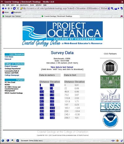
The final page shows the data, both in SI (meters) and in SAE (feet). The benchmark number, date and elevation are listed at the top, and the SI and SAE readings are in two separate tables. If you are using Windows, you should be able to merely highlight the table of your choice using your mouse (click once and drag down over the table) and use your browser's ``Edit'' menu to ``Copy'' the table. If you are using another operating system, you may have to click on the link that reads ``View data in text format.'' That will open a text window which can then be downloaded (hold down the shift key while clicking the link) or saved. After saving, delete everything but the numbers from the table that you want to use (SI or SAE) and use Excel's data import function to import the data (In the main menu, click on Data->Import External Data->Import Data and browse to the file that you saved.
See a screenshot copying data.
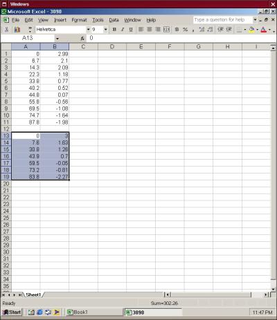
After you have copied the data into your Excel window, you should either add your own data or repeat the steps to add data from another date. Add the new data, distance and elevation again, directly under the previous dataset. We have chosen to use the data from 5/26/1990 for comparison. Leave a row or two so that you remember that there are two datasets and can tell which one is the original and which is the newer.
See a screenshot of pasting data.
After you have copied or imported your data into Excel, you will need to make a graph in order to visualize the data.
When graphing, we want distance to be on the X axis, and elevation to be on the Y axis. This is because the X values represent the ``independant'' or ``explanatory'' variable and the Y values represent the ``dependant'' or ``response'' variable. Another reason for doing it this way is that distance and elevation will be graphed in an understandable way: Distance will go along the ``ground'' of the graph and elevation will go up and down. To make it easier to make distance into the X axis and elevation into the Y axis, the data has been organized with the distance column first. Excel, and many other spreadsheet programs, will assume the first column is the independant variable. If your spreadsheet does not, you may need to adjust these in the graph properties.
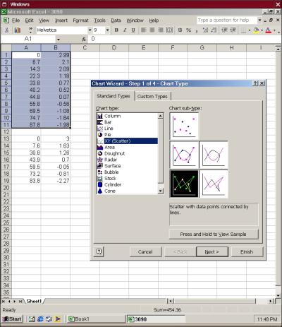
First, highlight the top dataset in the spreadsheet and either click on the ``Chart'' button in the toolbar or use the menu and click on Insert->Chart. You will want to chose ``XY (Scatter)'' so that you can define the X and Y axes, and click on the box that shows straight lines with datapoints, then click ``Next.''
See a screenshot of choosing a chart type.
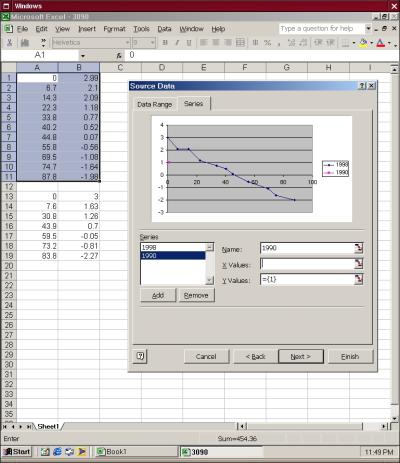
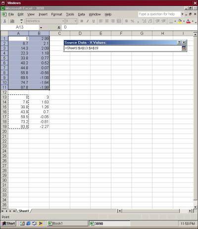
The next window will show a preview of the chart for the data that you highlighted, but you will want to have two charts on the same graph, so we have to add the next dataset. Click on the ``Series'' tab to enter the second data set. First, type the date, or other descriptive name, of your first dataset in the ``Name'' field. After you name the first dataset, click the ``Add'' button to create a second series and type the date or another descriptive name in the ``Name'' field. Go to the ``X Values'' field and click on the graphic or arrow at the right hand side of the input box. This will allow you to copy fields in the spreadsheet. Highlight the X column in your second dataset by clicking and dragging the mouse over the values, then click the arrow or graphic on the right of the input box again. Repeat the steps for the Y values.
See a screenshot of adding a title and axes legend.
See a screenshot of adding a second series.
See a screenshot of choosing the x axis for the second series.
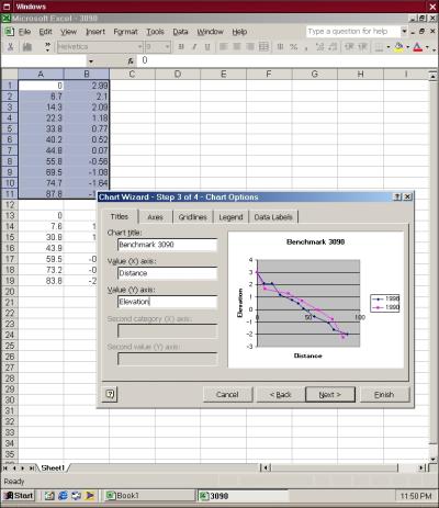
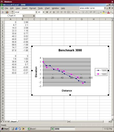
Your window should now show a preview with two lines, one with the original dataset and one with the second dataset. Click ``Next,'' and add a chart title and descriptive terms for the X and Y axes (Good terms are ``Distance'' and ``Elevation,'' respectively). You can also change characteristics such as the placement of the legend and the type of gridlines shown here. Click ``Next'' and chose either to create a new sheet, or insert into the same sheet (we chose the latter), then click ``Finish.''
See a screenshot of the finished page.
Now you have a graph with visual plots of two datasets. You can now determine where sand has eroded and accreted. Sand has eroded where the older dataset line falls BELOW the first- in other words, where the older elevation is now LOWER than it originally was. Sand has accreted where the older dataset line falls ABOVE the first- in other words, where the older elevation is now HIGHER than it originally was.